The XFL, originally launched all the way back in 2001, lasted just one season. It was the brainchild of WWE owner Vince McMahon and co-owned by NBC. It was designed to be rougher, harder-hitting, and even more entertaining than other football. It never quite caught on, though. The football, the main reason for being there, wasn’t good. Will this version be any better? Only time will tell, but after the recent announcement of team names, the important question is obvious: “Which logo is the best?” There are 8 teams in the league, and some of the logos look pretty good. Some of them… Not so much. Lets get to it, shall we?
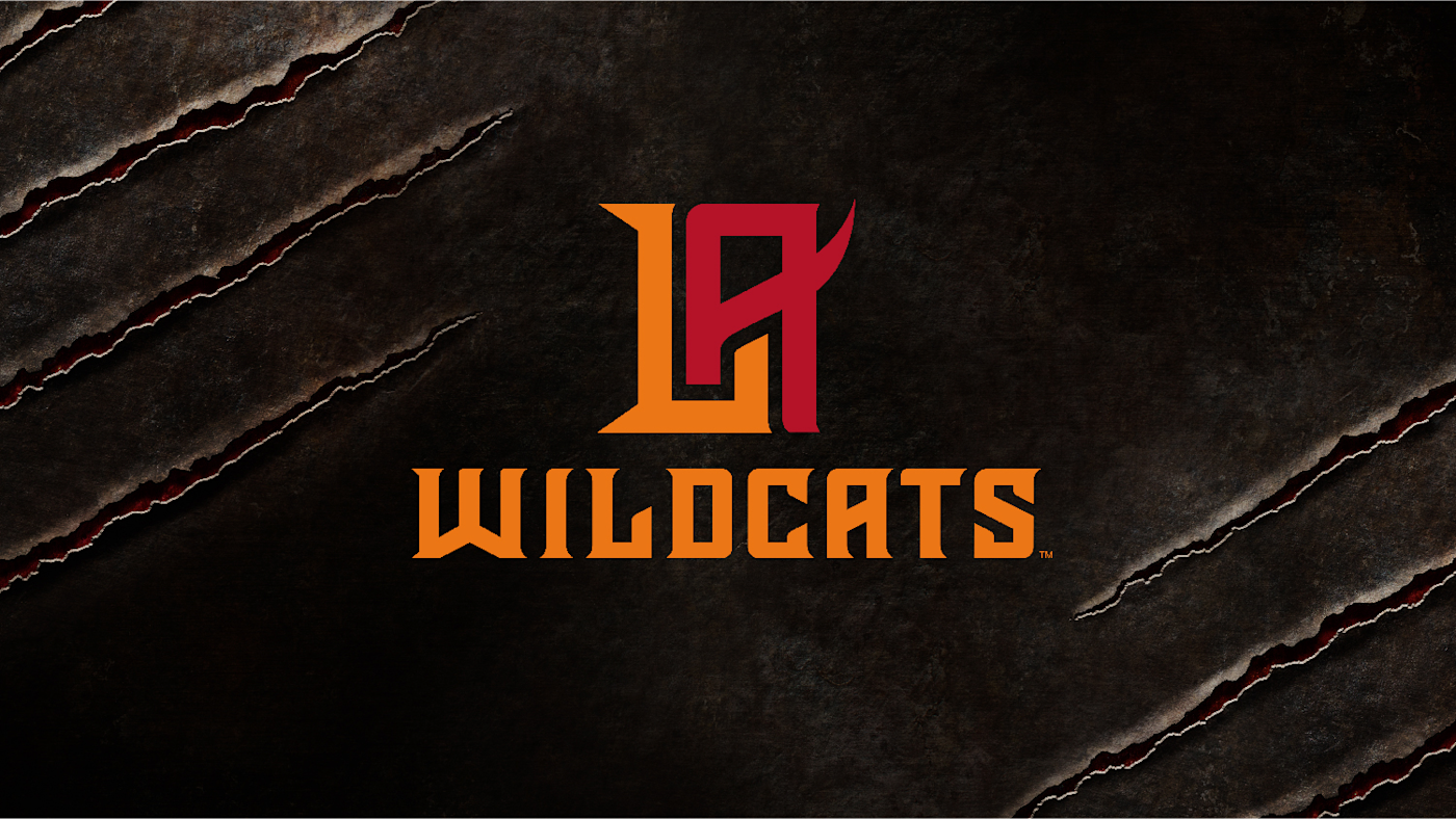
#8: Los Angeles Wildcats
Starting at the bottom, working our way up. This is like if “meh” and “I guess if we have to” got together at bar close on a Tuesday night, and out popped this turd. I know LA already doesn’t really care about the Rams, so what the hell is there to care about here? The text is bland, the colors are fine but don’t really get your attention, and the actual “LA” part is Just. So. Boring. Plus, compared to some of the rest of these names, Wildcats is a nothing.
I expected better, Vince.

#7: Seattle Dragons
This reminds me, a lifelong Iowa State fan, WAY too much of the UAB Dragons logo. And I’m still not over that one. Screw those guys.
It’s still better than that pile of LA garbage, though.
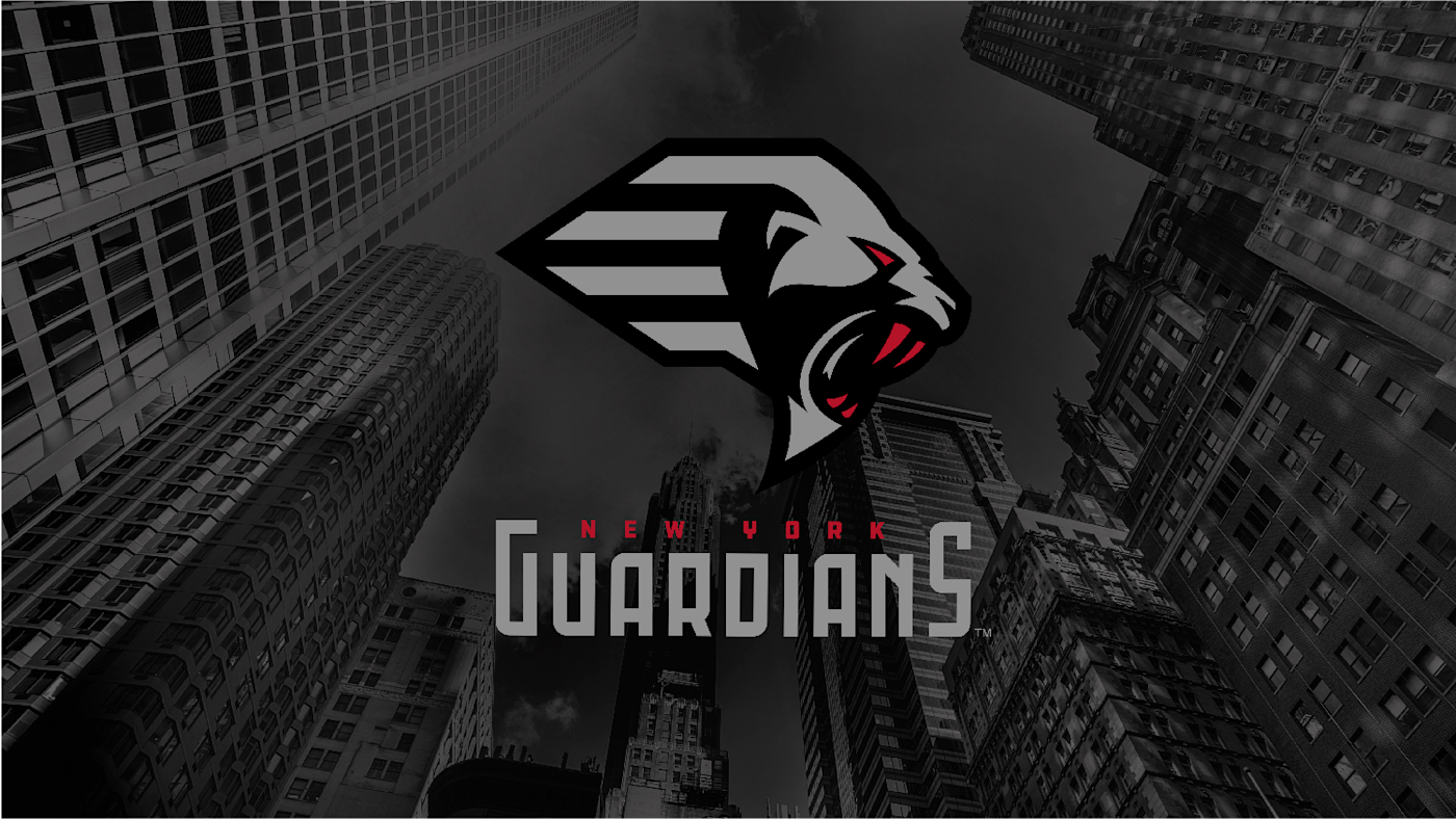
#6: New York Guardians
Now this is a fucking Wildcat. Yeah, I’m going to keep shitting on LA, because that thing really sucks.
I think they were aiming for a gargoyle vibe? Which kind of makes sense, in a way, but I also don’t really get the “Guardians” name. What are they guarding, and why are they guarding it in New York? There’s got to be somewhere that’s easier to guard whatever it is. I have many questions, and this logo answers none of them.

#5: DC Defenders
It’s pretty easy to see that DC is aiming for a superhero motif, but this (ironically) feels more like a Marvel logo to me. It’s not bad, but it’s not exactly good, either. Tony Stark should have been consulted on this one, maybe he would have come up with something a little snappier?
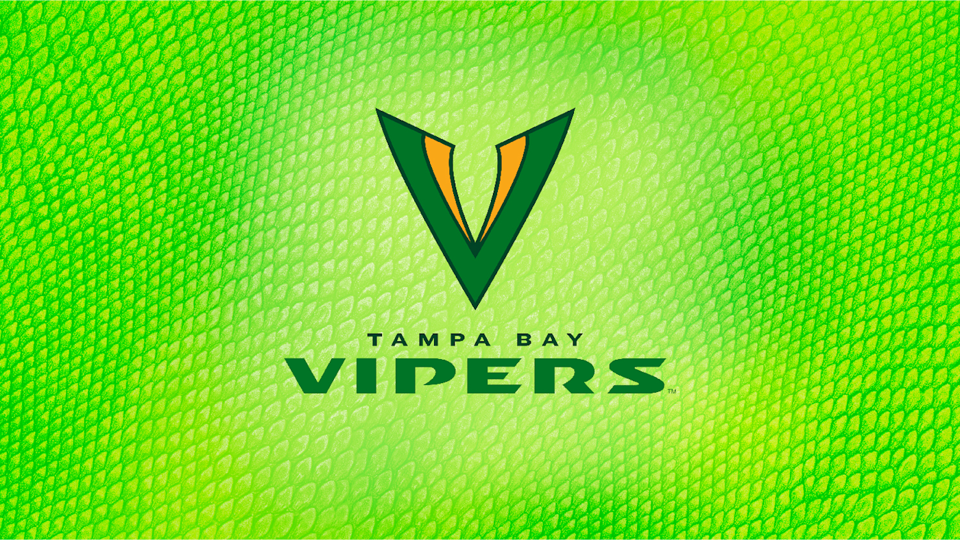
#4: Tampa Bay Vipers
Halfway there, folks, let bring it home strong. While pretty plain, I’m partial to the green and gold color scheme (#GoPackGo). Based on this picture, I’m seriously hoping they incorporate some snakeskin pattern onto their uniform or helmet. That would look pretty sweet. The more I stare at this logo, though, the more it looks like half of a vagina.
Sorry, got distracted there. Where was I? Oh, yeah, moving on.
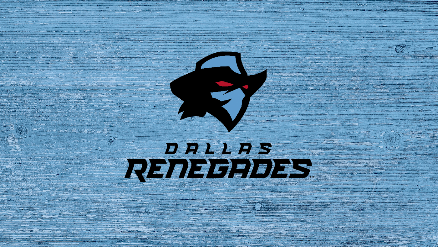
#3: Dallas Renegades
I can’t exactly describe what I like so much about this. Is it the menacing, glowing red eyes? The fact the this logo clearly has a sweet mullet under his hat? I don’t know, but I know I dig it.

#2: Houston Roughnecks
OK, this is 1000% the old Houston Oilers logo, right? We all see it?

But that is what I love about the Roughnecks logo. The hidden H? Magic. Continuing the oil rig theme, which is crucial to the home city? Key. The name Roughnecks just sounds like a football team, too. This was almost my winner.

#1: St. Louis BattleHawks
Now, yes, this is incredibly plain. But sometimes in simplicity, there is beauty. The blue/silver color scheme is clean, classic, and no nonsense. The logo isn’t too busy, which I think is why it beat out Houston in my rankings. It manages to be plain without being boring (*cough* LA Wildcats *cough*).
So there it is. My personal, expert, analysis of the new and improved (?) XFL logos. What do you think? Drop a comment below, find me on Twitter @WLCyclone, or hit up the site handle @tgatesociety to let us know how you feel! The XFL doesn’t start until February 2020, so we’ve got plenty of time to hash out our differences.
